Finding the best website designs is no walk in the park. There are so many attractive and award-winning options around, choosing the truly best ones takes time.
But we took a shot at it.
Behold our compilation of the best website designs. These 20 incredible websites were chosen by their usability, accomplishments, appearance, and undeniable wow factor.
Best Website Designs
- Species in Pieces
- Scepter & Sword Wine
- Tony D’Orio
- White Walnut Estate
- Prometheus Fuels
- Hoboken Yogi
- Burfa
- Queen Garnet
- Habitas
- Dryrobe USA
- Jannata Resort & Spa
- Adelaide Botanic High School
- Myles Nguyen
- Tomasz Bieńkowski
- Looks Like You Need Iceland
- Chiara Luzzana
- Delassus
- Nest Wi-Fi
- Patty and Bun
- Folk Strategies
1. Species in Pieces
Environmental awareness project
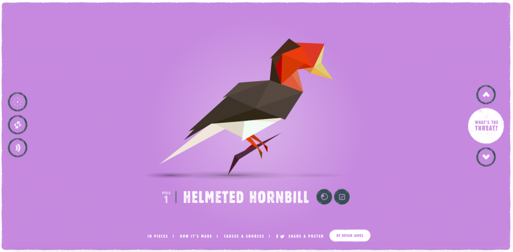
How to turn people’s attention to endangered species?
Amsterdam-based web designer Bryan James chose an interactive wildlife exhibition. This best website design contains geometric models of animals constructed with triangular shapes, accompanied by stats, videos, and helpful external links. Page color transitions, music, bubbly animation style—everything is presented in an elegant, interactive fashion.
Interesting facts:
- This excellent website design was built entirely using CSS
- Bryan James spent 5 months creating Species in Pieces
- You can even buy a poster of all the species on a special website
2. Scepter & Sword Wine Co.
Wine shop
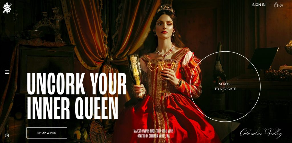
Visually stimulating. Dramatic. Bold. Commanding. Those are the best words to describe Scepter & Sword’s online shop. This amazing website design presents a line of wines from Columbia Walley, WA, and features jaw-dropping visuals, unconventional navigation, circular mouse cursor, and large typography. What a way to show off a unique brand identity!
Interesting facts:
- Scepter & Sword’s was named the best website design of the day last month by Awwwards
- The team behind the website design studied Post-Renaissance paintings with Queens to create realistic and accurate photos
Mobile commerce makes up over 30% of all online sales. If you’d like your online store to have an app, here’s How to Build an Ecommerce App.
3. Tony D’Orio
Portfolio website (photography)
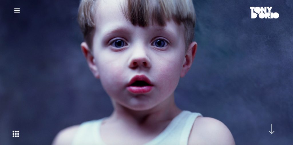
Tony D’Orio’s hyper-realist image style is amazing, and so is his portfolio website design. It’s visually packed with photos, playful, colorful, and engaging—everything to attract our attention and get us interested in seeing more. Every photo tells a unique story, and this cool website facilitates it with smooth animations and large views.
Interesting fact:
Besides having one of the coolest homepage designs, D’Orio’s website also lets you create a PDF and download his photos in two clicks. See “Create a PDF” in the main menu.
4. White Walnut Estate
Winery and online shop
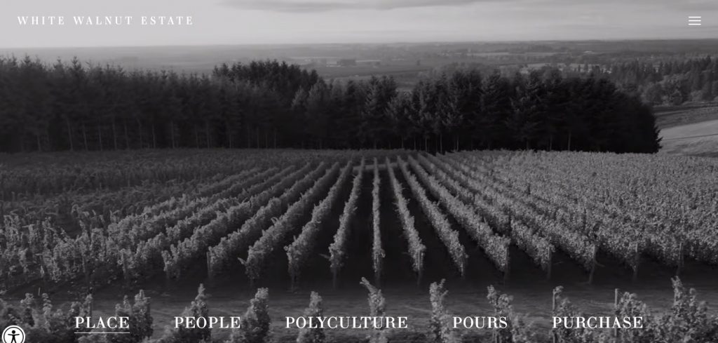
Minimalist, clean, black and white, and intuitive. Those are the best words to describe this great website design. The black and white photography and drone footage perfectly support the minimalist website style and serve as a great introduction to the world of Oregon winemaking. Also, note concise, on-point, and captivating copywriting.
Interesting fact:
- Designers made bottles of wine and grape clusters the only colored elements in this website design to focus the attention of visitors
5. Prometheus Fuels
Innovative electro fuel startup
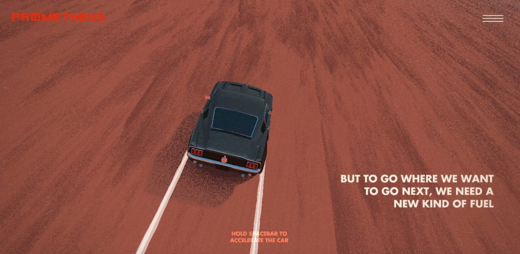
If you think that this website design looks a bit like a game, you’re right. Prometheus Fuels offers an interactive, engaging, and unique experience to visitors thanks to user-controlled website features. The interactive elements are necessary, since the company needs to explain how the heck it is creating fuel from the air.
Interesting fact:
- Prometheus Fuels has been recently named Site of the Day by Awwwards
- The company has recently received investments from BMW and Maersk
6. Hoboken Yogi
Yoga Instructor
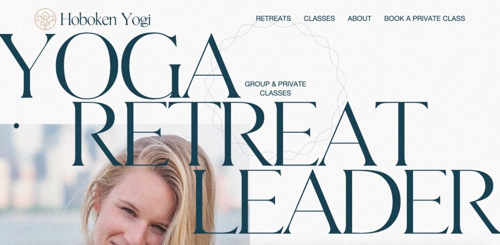
The team behind this excellent website design has beautifully captured their client’s identity. Scrolling through the website feels like viewing a page from a cool magazine, and changing background colors make it more interactive. Large typography and great use of white space ensure top readability, which is important to visitors.
Interesting fact:
- Hoboken Yogi organizes yoga retreats to places all around the world. The location of the upcoming trip: Costa Rica
7. Burfa
Tech and investment company
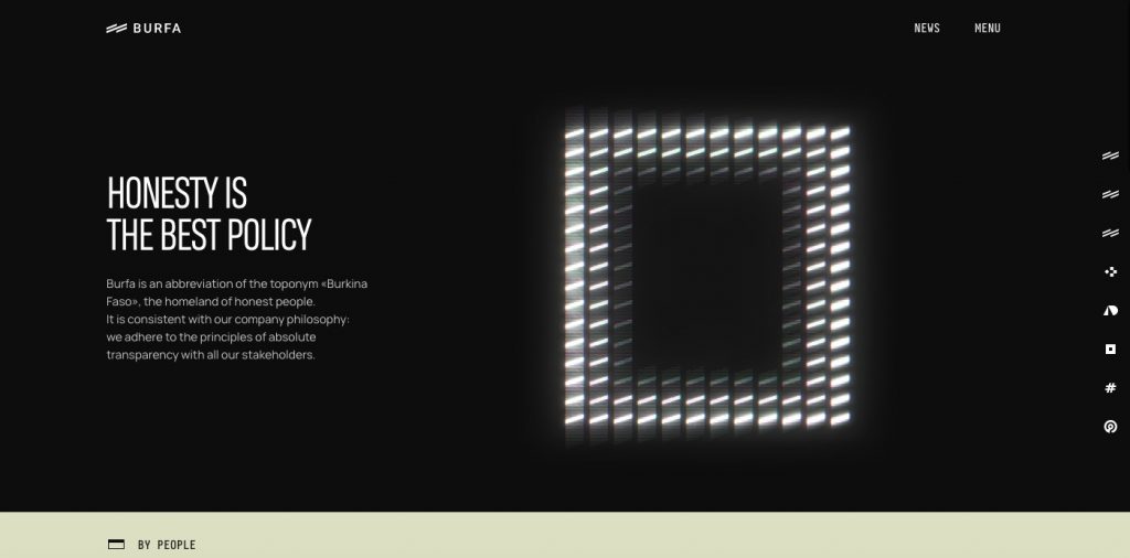
This amazing website design is futuristic and offers some unusual solutions. The navigation is divided into two parts, yet we find information pretty easy. Animated elements invite us to interact with the website content, which is story-driven to represent the company’s commitment to an excellent user journey.
Interesting fact:
- Burfa has recently received an honorable mention from Awwwards, which called the design “minimal, substantial, and techy.”
8. Queen Garnet
Superfood online store
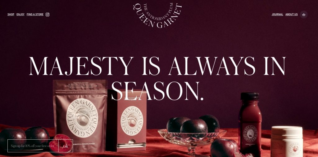
This best website design seamlessly combines the company’s unique branding and easy product discovery. High-resolution images and large, elegant typography are responsible for keeping visitors focused and learning about the products. At the same time, the typography also facilitates branding, along with a deep purple color palette used throughout this attractive website.
Interesting fact:
- The brand’s plum is cultivated to be “the queen of antioxidants,” so the design team had the task to present the products appropriately. That’s why each product is presented as premium and exclusive, and the use of classy fonts supports the brand’s presentation.
9. Habitas
Hospitality management group
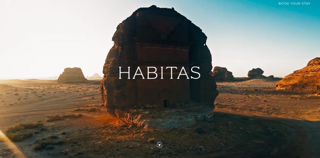
Here’s another website example using super-attractive imagery to attract attention and inspire visitors in a cool way. The stunning visuals do an excellent job promoting captivating traveling experiences provided by the company, and put us in the mindset of excitement and adventure. Subtle scrolling and minimum copy also make that journey very smooth.
Interesting fact:
- Habitas is considered a cool lifestyle hotel (at least that’s how the press calls it), so this web design awesomely supports this description by creating a sense of luxury even on the website
10. Dryrobe USA
Online store selling outdoor robes
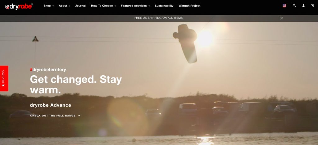
Wondering how to create the best website design for a single product category? Check out Dryrobe. This good-looking website follows the best practices of outdoor brands: amazing visuals (both pictures and videos), powerful messaging that inspires confidence, and plenty of conversion opportunities.
Interesting facts:
- Inspiring videos of products used in real-life situations make a difference for outdoor brands’ websites
- Dryrobes were used by the Team US (USLA National Team) and the Royal lifesaving society
11. Jannata Resort & Spa
Hospitality Group
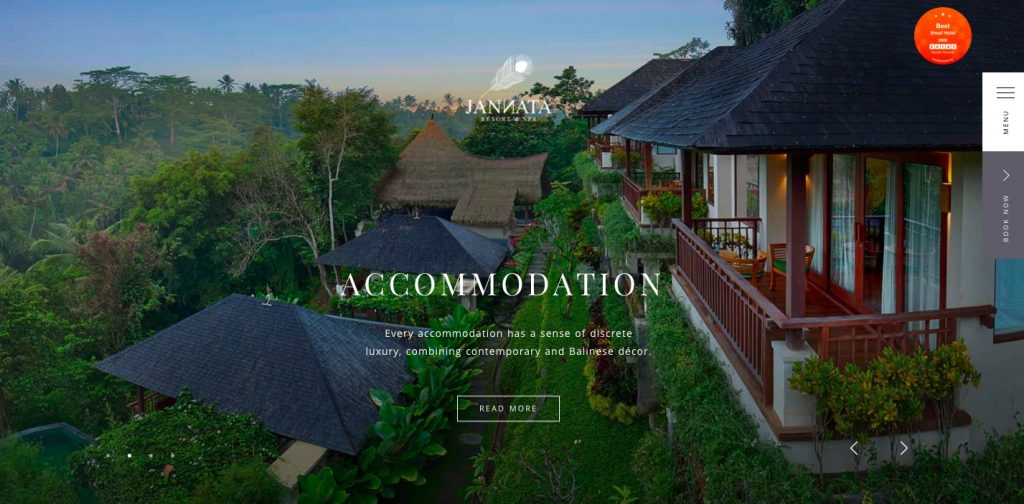
This example of website design looks more like a page from a luxury travel magazine cover. Smooth transitions, high-resolution photos, and elegant typography make an excellent first impression (which counts a lot in the hotel business). Throughout the experience, this excellent website invites you to click on buttons to get interactive views of rooms. And, of course, booking a room is super easy and quick.
Interesting fact:
- This example of website design got an honorable mention in Awwwards
Apps are another great business idea for the hotel industry. This post on the Cost of Building a Hotel Booking App has details on the startup costs.
12. Adelaide Botanic High School
Pubic high school
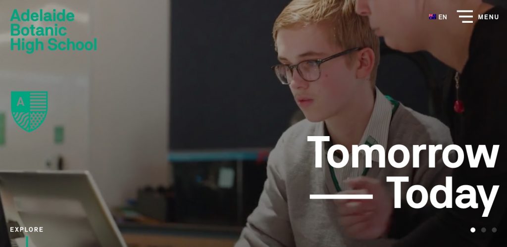
Adelaide Botanic High School has by far the best website you’ll find from a public school. This website design does an excellent job introducing visitors to the facility with quality videos and large images. Also, the website clearly communicates the school’s goals and values with large typography, simple navigation, and useful links.
Interesting fact:
- Adelaide Botanic High School is South Australia’s first vertical school (a multi-story building designed to accommodate more students than traditional school buildings)
13. Myles Nguyen
Digital portfolio
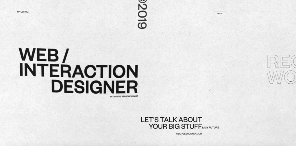
Myles Nguyen’s portfolio is a prime example of the use of white space. This technique leads visitors right to the most important parts while allowing their eyes to “travel” comfortably. Such an approach makes typography and font core web design elements. One more cool thing: horizontal scrolling, which also saves a lot of space.
Interesting fact:
- Myles Nguyen calls himself “an award-losing web designer.” So far, his works have been an “honorable mention” on Awwwards only once
14. Tomasz Bieńkowski
Digital portfolio
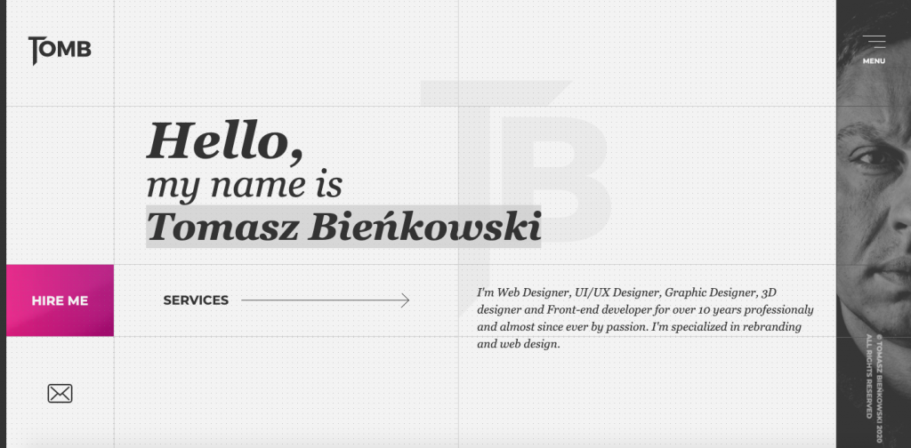
Another awesome example of a portfolio website. This example offers a compact, creative, and modern web design, added with great interactive features. Tomasz includes all the essential info at the top of the website, but we just can’t resist playing with those cool-looking smooth transitions.
Interesting fact:
- This website design has been featured on Awwwards; so far, only as an honorable mention
15. Looks Like You Need Iceland
Tourism-promoting website
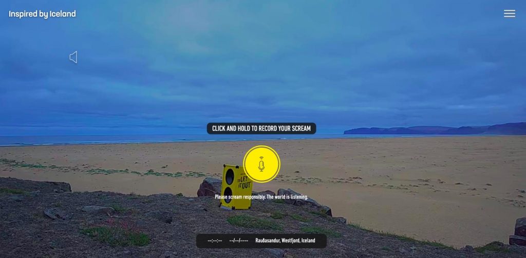
Screaming is known as a therapeutic tool… But what does that have to do with web design? Well, this website example takes it to a whole other level. Visitors are invited to record their screams that will be then broadcasted via speakers into the Icelandic wilderness.
Interesting fact:
- The website’s name hints at an idea that the benefits of screaming come from being able to make loud noises into a wide, open space. Iceland’s wide open spaces and Europe’s lowest population density make it a perfect place to try this therapeutic method
16. Chiara Luzzana
Personal website
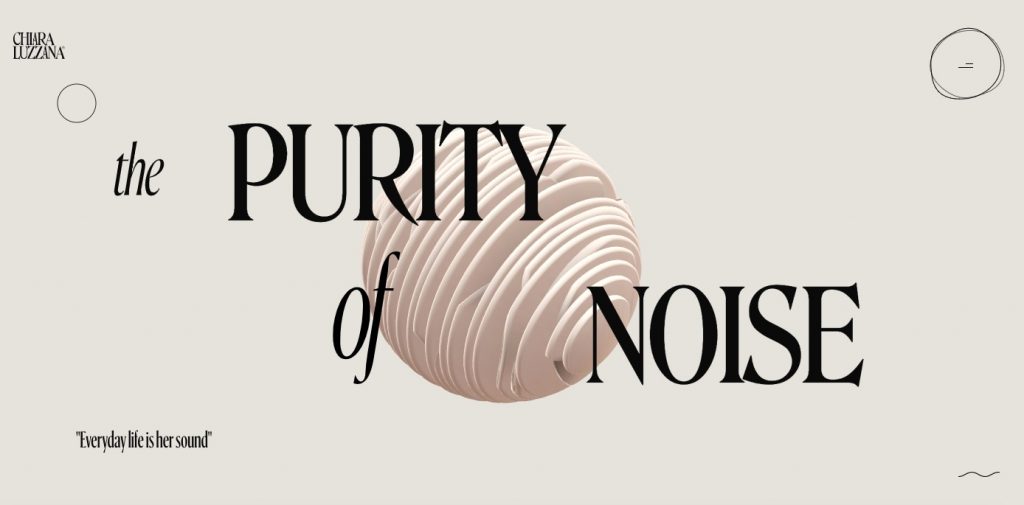
Want to see an example of a website that combines visual and audio media? Then check out this web design. Every interaction is accompanied by charming auditory additions, which facilitate the personal brand of Chiara Luzzana, a sound designer. Fluid animations support the sound effects, making the website look “alive.”
Interesting facts:
- This website design was Awwwards’ Site of the Day on July 13, 2020
- The main element of this top web design is a 3D sphere that represents the rich audio spectrum of sound waves. That’s why it reacts to changes in the website’s background music and even clicks from visitors.
17. Delassus
Agricultural company
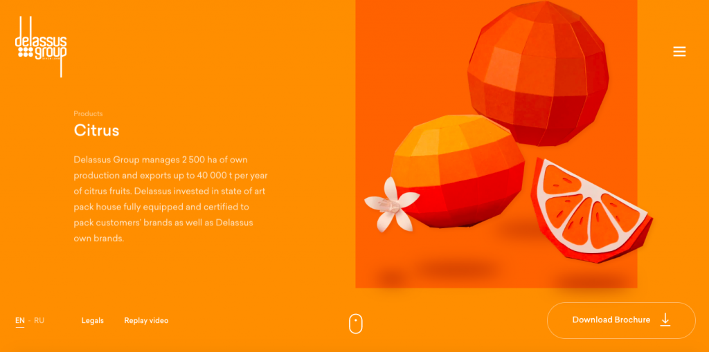
Delassus’s design reminds that of Species in Pieces, only applied to agriculture. This time, though, the website uses horizontal parallax scrolling to show off the variety of fruits and vegetables grown by the company. And 3D designs of the product range make the design bold and modern.
Interesting fact:
- Delassus was named the top website design by Awwwards in June 2020
18. Nest Wi-Fi
Product website
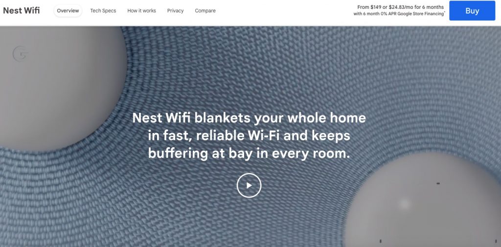
Google has achieved a perfect combination of light colors, easy scrolling, good-looking typography, and cool animations to produce an uncluttered, visually appealing website design. Together, the elements explain the advantages of Nest Wi-Fi devices without being too “salesy” and “pushy.” An excellent example of a cool product launch page experience.
Interesting fact:
- Nest Wi-Fi was recognized as a “Website of the Day” according to CSS Design Awards when it first launched
19. Patty and Bun
Burger shop
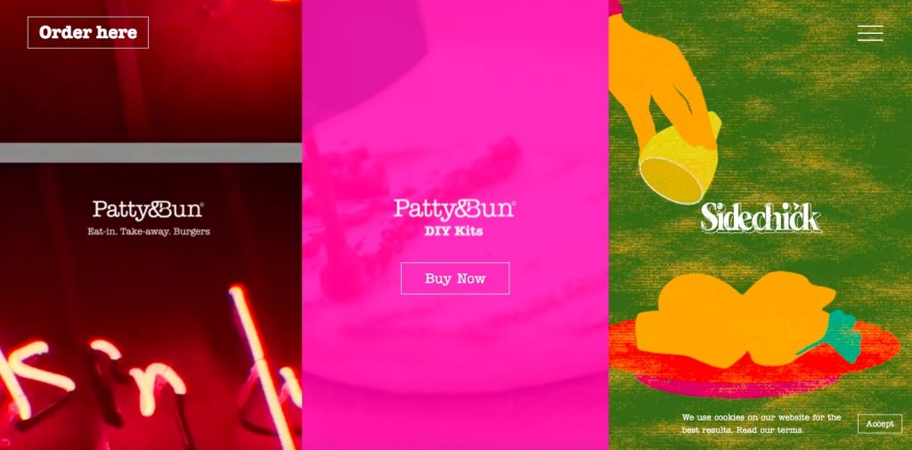
Looking for a quirky, cool, and playful design? Then Patty and Bun is the best website design to see. The homepage opens with three quick film-like videos that grab our attention with a barrage of cool images. Despite this unusual design and unexpected visuals, navigating the website is easy, as the main menu takes over the homepage when clicked on.
Interesting fact:
- This website design is rich in red (especially on loading screens)—a proven color to get attention and jump-start appetite
20. Folk Strategies
Marketing agency
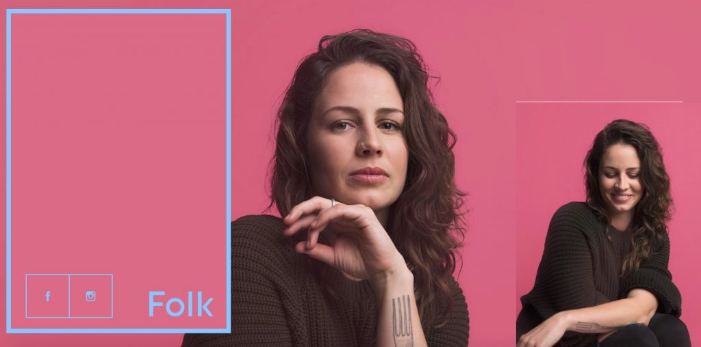
This site example is one of the most unusual and creative ones we’ve ever seen. To view the menu, you need to drag it into view (which is pretty simple). This way, the website conveys the business’s nature—”an unconventional brand strategy service.” Overall, the design is aesthetically pleasing, rich in colors, and smooth in changing animations.
Interesting fact:
- Agency’s name was an idea behind the cool homepage design, which shows a series of people working in the company.
Useful Web Design & Development Resources
Summary
Are you looking to create a website or redesign an existing one? Or maybe you’re looking for some direction in your web design project idea? If yes, then book a free consultation with our specialists to get expert advice.
 (2 votes, average: 5.00 out of 5)