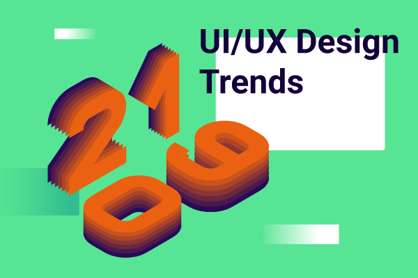
Introduction
2019 is officially in its heyday, and it’s high time for us to check out what’s new whith the UI/UX design trends. While the last year happened to be the year of the usual comfy flat design with a little sprinkle of chaos, it wasn’t the easiest task to come up with digital design predictions for 2019.
If you want to go hand in hand with the latest design trends, stay with us a for a little bit longer to check out the list of what’s kicking this year our team came up with.
#1 Custom Illustrations
The hottest digital design trend that will be hitting us in 2019 is a custom-made illustration. We’ve started noticing the rise of unique custom illustrations back in 2016 and looks like it’s going to reach its highest points in 2019. According to inc.com, unique and catchy illustrations have 7 times higher conversion rates compared to neutral (not to say meaningless) stock photography. Unique graphics unseen before online is a powerful tool for catching users attention and attract them to the content you post.
This trend declares that the digital space started becoming more artistic and welcoming for imaginative creators. This year custom artwork is going to be reintroduced to create a wonderful visual language to shape up brand’s personality. We’ll also start seeing more often that particular styles which seemed to be too unusual and even edgy in 2018, now have all the chances to turn into commercial and even mainstream as people are getting used to them. Namely, abstract illustrations, different textures overlapped, bold proportions, ironic images, and shift from realism to daring sketches looking like a five-minute job already proliferate in UI/UX. Feel free to let your creativeness loose and finally try your hand in a variety of styles and techniques you’ve wanted to master, as the custom illustration trend can be called the UI/UX trend of the year with no exaggeration.
#2 Emphasized Typography
Obviously, typography has been in the spotlight since always, mostly due to the fact that the vast majority of digital products — like websites or apps — consist of text for about 80%. Product owners communicate with their users through words and letters, so these can’t look random. In 2019, bold, creative typography becomes an inseparable part of the design trends group but shifts from aesthetics to easy and comfortable perception. With the rise of minimalism in digital design we’re talking about further on, big couraging fonts that might even look overexaggerated sometimes remain the only accent and artistic expression element.
A bit smaller yet still an attention-worthy tendency with typography in 2019 is unique fonts. A lot of brands already have them inspiring others to come up with their own font and forget about the infamous stand out from the crowd issue.
#3 Minimalism Reinvented
We live in the era oversaturated with literally everything from food and clothes to information. No wonder minimalism-inspired movements like zero waste and sustainable approach to life are actively penetrating digital space as well. If by hearing minimalistic UI/UX you imagine nothing but black text over white background, that’s where you’re wrong. This time, minimalism in UI isn’t all about the visuals — bright colors and vivid illustrations aren’t forbidden whatsoever — but the user’s journey through your product.
In 2019, we’re going to move away from informational overload in apps and websites. Not only you should avoid piling users with unnecessary notifications and lots of pop-ups. Don’t create this image of a very busy website/app/other software product that fights for every second of users’ attention to the point they start feeling anxious and annoyed with it. Clean and uncluttered, these are the it-words for 2019 UI/UX.
by Taras Migulko for Awsmd
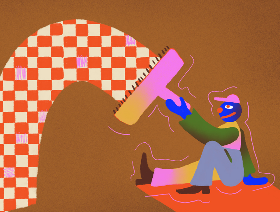
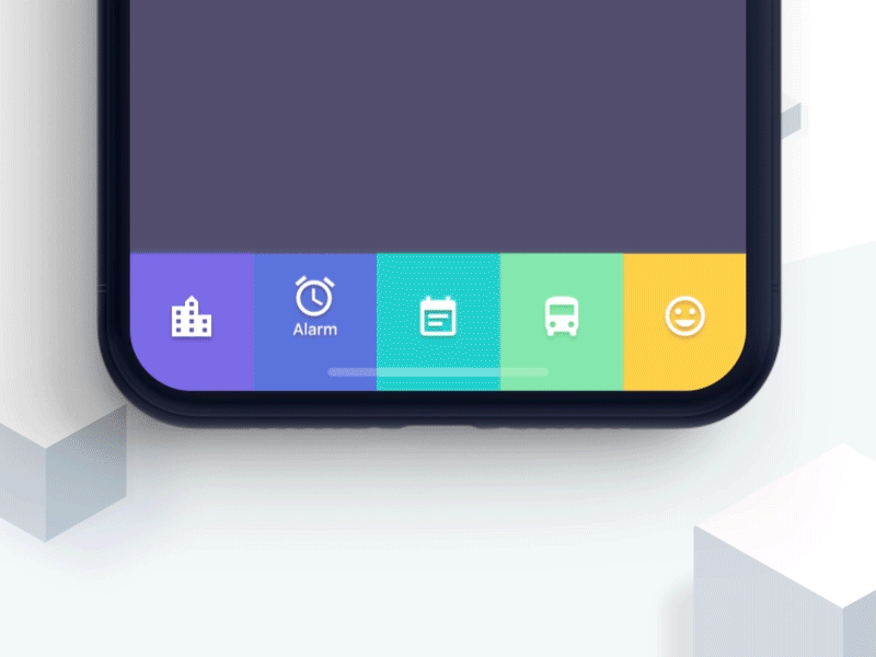
#4 Animations and GIFs
A lot of talks has been going around the microinteractions, but what are they exactly? In short, microinteractions are small animations brand use to engage users and help them use the product. They are the top of UX best practices and remind to be one of the most significant UX trends.
Microinteractions have been there for a long time, even if you didn’t notice any. Recall seeing the popping out heart when liking your friend’s twit? Yup, that’s one’s a microinteraction. Didn’t that make you feel like you are the one shaping the interface, and not the other way around? Making use of details can bring design to the next level of awesomeness.
Talking about animation, GIFs, and SVGs, also play a crucial role in making content more engaging for the end-users. They add a perk to your newsletters, ads, illustrations, icons, logos, and any other elements you generate.
Cinemagraphs are also having a blast! There are high-resolution photos with a repeating video loop for a selected part of the image. Think about a picture of the camp with an animated fire burning. Expect to see more cinematography coming over in 2019.
by Dannniel
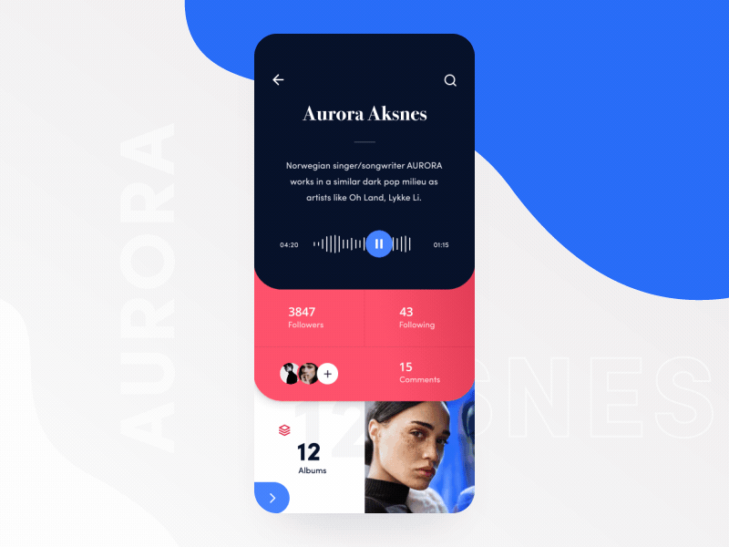
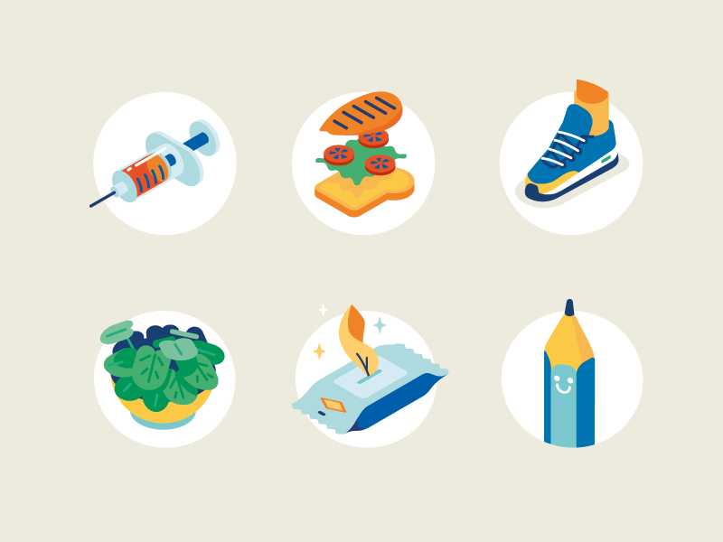
#5 Isometric Icons
by Patswerk
Isometric in its primary meaning as a 3D drawing of an object isn’t new to anyone, especially in websites and print designs. However, it’s going to get an interesting twist this year — isometric techniques for icons. Of course, we’ve seen 3D icons in the past but in 2019, this trend is promising to hit the market massively. For a while, icons applied flat aesthetics only and the world is now ready to switch things up. Adding dimension through isometric elements like shadows and perspective will only make icons and icon-based figures more eye-catching without being too complex or hard to perceive. The thing is, isometric icons look more natural and appealing for a human eye, yet still, they created using flat layers which don’t generate technical obstacles for designers.
Isometric design is a great way of adding hierarchy and smooth flow to the UI/UX of a digital product. If implemented well, it would work perfectly for literally any industry or product by bringing interesting shapes, depths, and simplicity without losing all the great features of flat design we love. Although a lot of designers continue to argue whether isometric is suitable for every project, mostly because of a cartoon-like style of it, we recommend you to check out this trend and try to create your own set of isometric icons.
#6 Flat Design Becomes Material & Abstract
As with the isometric design, shadows are officially secured their positions for the whole 2019. These guys were put on the back-seat when designers decided to take a step away from skeuomorphism in favor of flat, 2-dimensional approach.
However, as Google re-thought shadows in the Material Design approach to the UI, it showed great success in making users pick up on the visual hierarchy. Shadows quickly gained momentum and grew past the Material into the world.
Designers reconsidered their understanding of shadows ever since and embraced shadows in their interfaces. These new shadows have not only taken different forms and expressions (large, soft, colored, etc.), they are used as an instrument to add depth and dimension, unlike their bold and harsh “drop-shadow” predecessor.
#7 Bold & Unconventional Colors
Customers into bright, standoffish color schemes that take away their attention and stick it to the screens. This year will definitely be it for bold color combos. What do we expect to see in 2019?
It will definitely get overtaken by hair-raising color transitions, like in case of Instagram, as they have rocked it with their new eye-popping UI redesign. Duotones also join the group of 2019 hottest design trends. These mean guys are brought back by Spotify, as they have managed to take the appealing color combinations to the next level.
Besides, the 80s and 90s-inspired bright electric tones are also getting quite popular, as the kids of the era are taking over the internet once again. You can expect to see around more of the nostalgic themes this year.
Summary
All-in-all, the upcoming trends are showing a shift towards chaos and experiment. Leave the usual comfort zone of functional design, think bigger. Empowering visuals, bold letters, and bold coloring are going to help you break the pattern. Do not be afraid to take risks and embrace your creativity in 2019!
 (1 votes, average: 5.00 out of 5)