Introduction
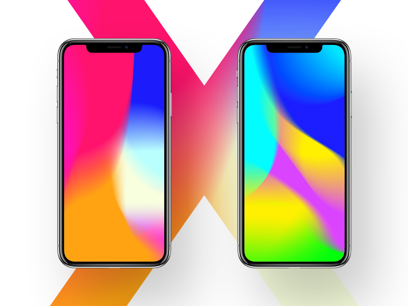
Just last week Apple has started selling iPhone X (pronounced “Ten”) – the revolutionary model marking iPhone’s 10th anniversary.
Apart from innovational edge-to-edge Super Retina OLED display that adds vertical space on the screen, new model ditches comfy home-button and changes the way users interact with a smartphone.
So how do we design iOS apps for the X? Our designers have stocked up some tips for those who want to build neat user experiences for iPhone enthusiasts.
New screen sizes
While the width of the new screen reminds the same as that of iPhone 6, 7, and 8, it is a bit (145pt) taller. As a result, there is more vertical space to mind (about 20%+). So in order to design for iPhone X, you will have to use the same artboard as for 7-8 Plus (375x812px), and export images in @3x for the Super Retina Display.
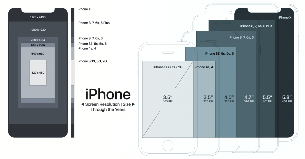
Good news for guys that use native iOS components (e.g., navigation bars, tables, collection views, tab bars, etc.): your app will automatically adapt to the new iPhone. In case of a custom layout, it may need some iterations to match new screen, but it shouldn’t be that much work.
Show off the whole screen
Apple in their Human Interfaces Guides kindly asks not to hide the cut-outs in designs to make it match the old school iPhone style. Show it off, instead. Rock the ‘X’ features.
Mind the safe area
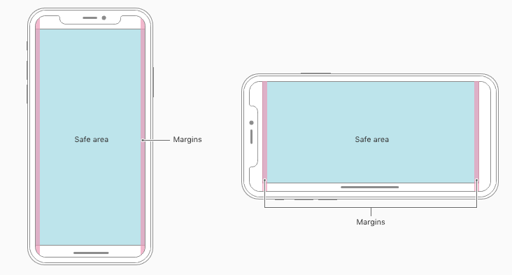
Unlike with previous iPhone models, here you have to place and align all critical content to the center so that interface elements won’t get chopped down by flagman’s sensors or corners.
Use Auto Layout to place UI elements within the safe area automatically.
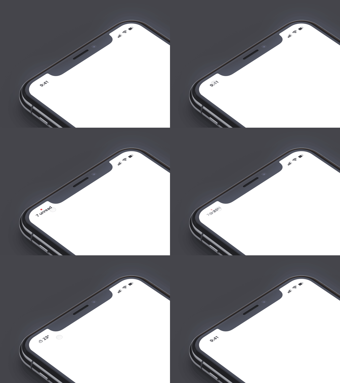
Embrace the status bar
Let the status bar live its own separate life. Unique cut-out rectangle has a frontal camera and all necessary sensors but leaves enough space for status bar updates. Apple has designed it in such way to make all useful information about the phone visible to the user at any time.
Mind the higher position of the new status bar. Apple recommends updating your app’s status bar position from fixed to dynamic so it’d be able to adapt on iPhone X easily.
No home button
Home indicator displaced the usual home button we grew to love. At first glance, it’s the same feature. Thus, looking carefully shows that home indicator, unlike a hardware button, relies on gestures to work correctly. So for proper detection, these gestures need some space.
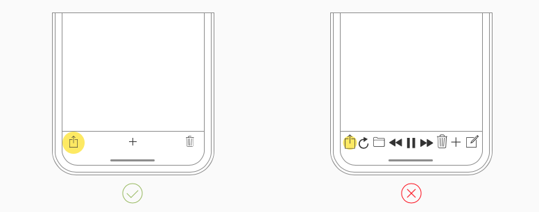
Avoid placing interactive content at the very bottom
Home indicator takes the lower part of the screen. This part is meant for using intuitive gestures.
For example, if your app delivers full-screen user experiences and has custom gestures that should take over, then while the first swipe would still call to app’s functionality, the second one would invoke system gesture.
Be careful, make sure users do not have to overthink your app.
Do not hide Home indicator
Completely hiding the Home indicator is also a bad idea since users heavily depend on it to use gestures. The new Home indicator in iPhone X will automatically fade out and completely disappear when the screen is not touched for some time. As the user touches the screen, the indicator will reappear again.
Color reproduction
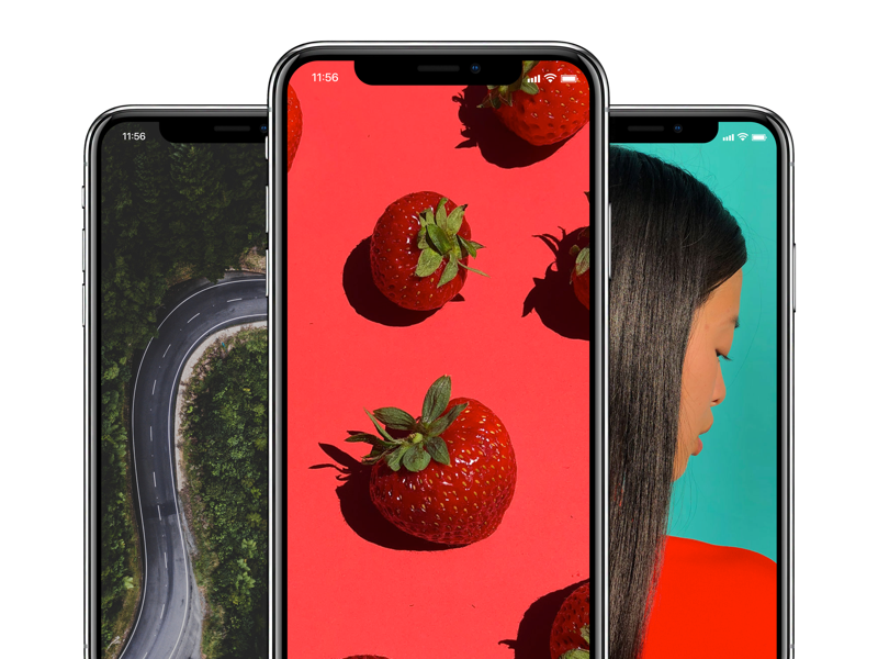
Colors are much more vivid and more vibrant on iPhone X’s display thanks to the P3 color space instead of sRGB. Use wide color to improve the visual experience from watching videos or looking through photos.
Displaying video content
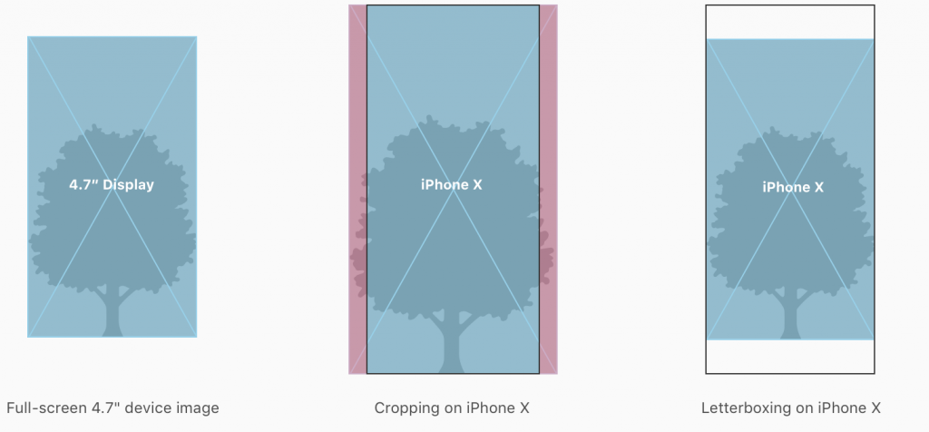
iOS system provides two types of viewing modes: full-screen and fit-to-screen. By default, the system goes into the viewing mode that suits best. Thus, we recommend sticking to fit-to-screen to make sure that entire video is visible. Undoubtedly, there will be some letterboxing, but at least all video will be on a screen.
You can allow users to choose whether to go with full-screen or fit-to-screen in their settings.
Surviving the loss of Touch ID
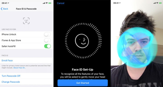
iPhone X dropped the Touch ID technology that worked as the sensor in home button scanned users fingertips. The new device provides a more advanced and secure (wonder about that) way of unlocking – Face ID. Face ID uses some mean algorithms to detect the particular properties of user’s face and unlock the phone. It entirely replaces Touch ID in saving passwords and accessing apps.
Make sure to change the all the references to the Touch ID inside the app, and replace all automatic authentication functionality with Face ID.
Summing up
- iPhone X 145pt taller
- Use Artboard 375x812px
- Show off new cut-outs
- Mind the safe area
- Status bar split in two
- No home button but home indicator = no interactive elements at the bottom
- Richer colors with P3 color space
- Face ID for Touch ID, different operating principle but same result
Preview the app on iPhone X
Use the Xcode 9 simulator to check out how the UI looks and get rid of unwanted croppings if needed.
To design consistent user experiences for iOS11 and iPhone X, Apple covered your need in new resources for Sketch, Photoshop and Adobe XD here.
Have more questions? Ask us in comments or read more on Apple Human Interface Guidelines for iPhone X.

